Alert
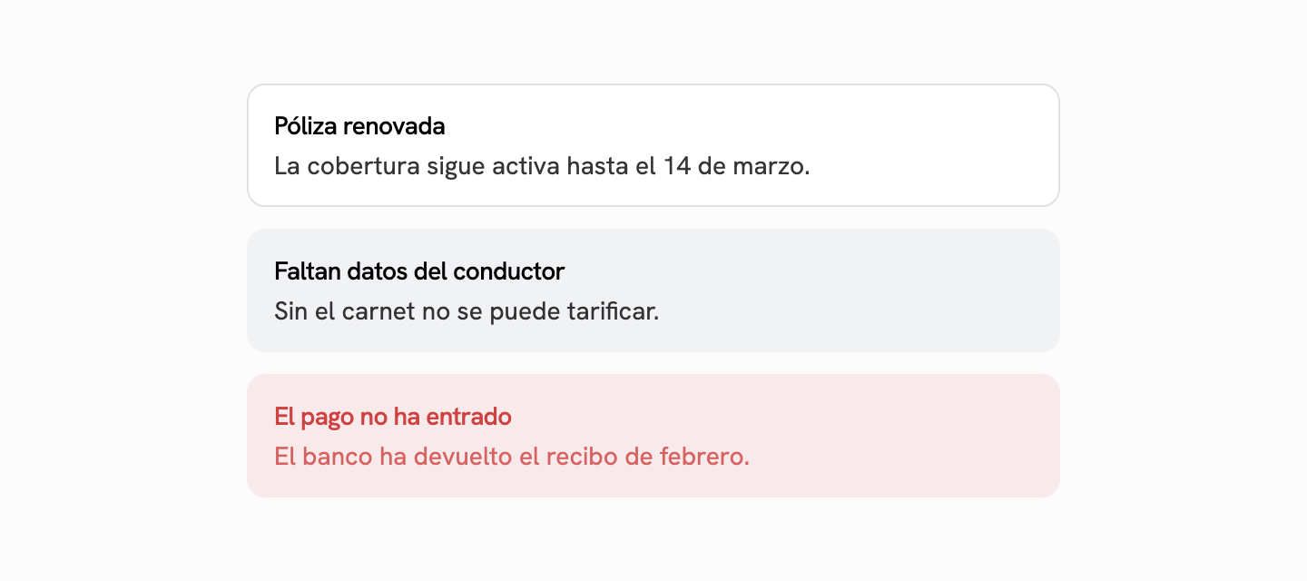
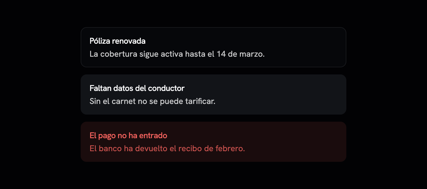
El aviso que ya está en la página, no el que interrumpe.
Displayclass-variance-authority
Installation
npx shadcn@latest add @saastro/alertPreview
Source Code
import * as React from "react"
import { cva, type VariantProps } from "class-variance-authority"

import { cn } from "@/lib/utils"

/**
 * Markup puro: el aviso que ya está en la página, no el que interrumpe —para
 * eso está `alert-dialog`—.
 *
 * `role="alert"` solo en `destructive`: el lector de pantalla interrumpe lo que
 * esté leyendo, y hacer eso por una nota informativa es maltratar a quien lo
 * usa. Los demás se leen cuando toca.
 */
const alertVariants = cva(
  "relative grid w-full grid-cols-[0_1fr] items-start gap-y-0.5 rounded-lg border px-3.5 py-3 text-sm has-[>svg]:grid-cols-[calc(var(--spacing)*4)_1fr] has-[>svg]:gap-x-2.5 [&>svg]:size-4 [&>svg]:translate-y-0.5",
  {
    variants: {
      variant: {
        default: "bg-card text-card-foreground",
        info: "border-transparent bg-muted text-foreground [&>svg]:text-muted-foreground",
        destructive:
          "border-transparent bg-destructive/10 text-destructive [&>svg]:text-destructive",
      },
    },
    defaultVariants: {
      variant: "default",
    },
  }
)

function Alert({
  className,
  variant,
  ...props
}: React.ComponentProps<"div"> & VariantProps<typeof alertVariants>) {
  return (
    <div
      data-slot="alert"
      role={variant === "destructive" ? "alert" : "note"}
      className={cn(alertVariants({ variant }), className)}
      {...props}
    />
  )
}

function AlertTitle({ className, ...props }: React.ComponentProps<"div">) {
  return (
    <div
      data-slot="alert-title"
      className={cn(
        "col-start-2 line-clamp-1 min-h-4 font-medium tracking-tight",
        className
      )}
      {...props}
    />
  )
}

function AlertDescription({ className, ...props }: React.ComponentProps<"div">) {
  return (
    <div
      data-slot="alert-description"
      className={cn(
        "col-start-2 grid justify-items-start gap-1 text-sm opacity-80 [&_p]:leading-relaxed",
        className
      )}
      {...props}
    />
  )
}

export { Alert, AlertDescription, AlertTitle, alertVariants }
Registry Setup
Add the Saastro registry to your components.json:
{
  "registries": {
    "@saastro": "https://ui.saastro.io/r/{name}.json"
  }
}