Browse all 18 blocks. Click any block to see the full preview, source code, and install command.
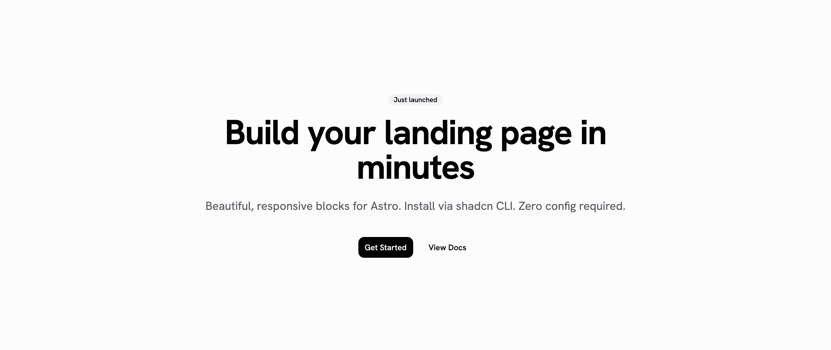
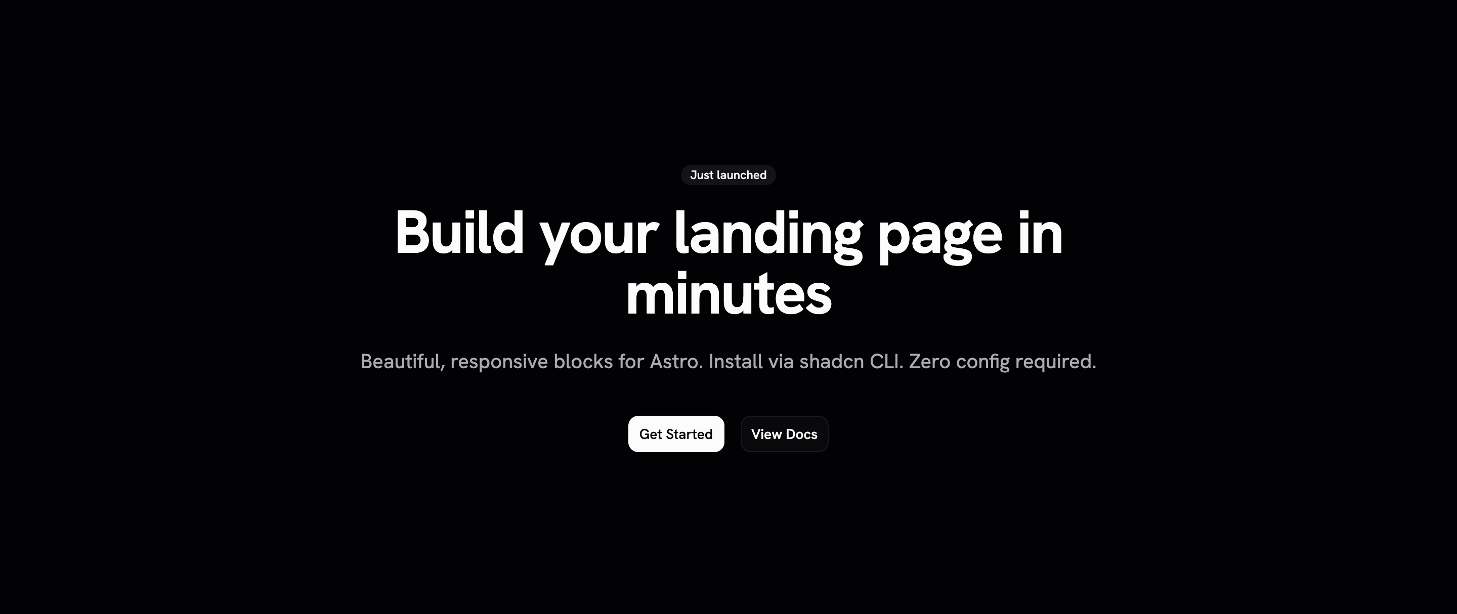
Centered hero with badge, heading, description, and dual CTA buttons. Zero-JS Astro component.
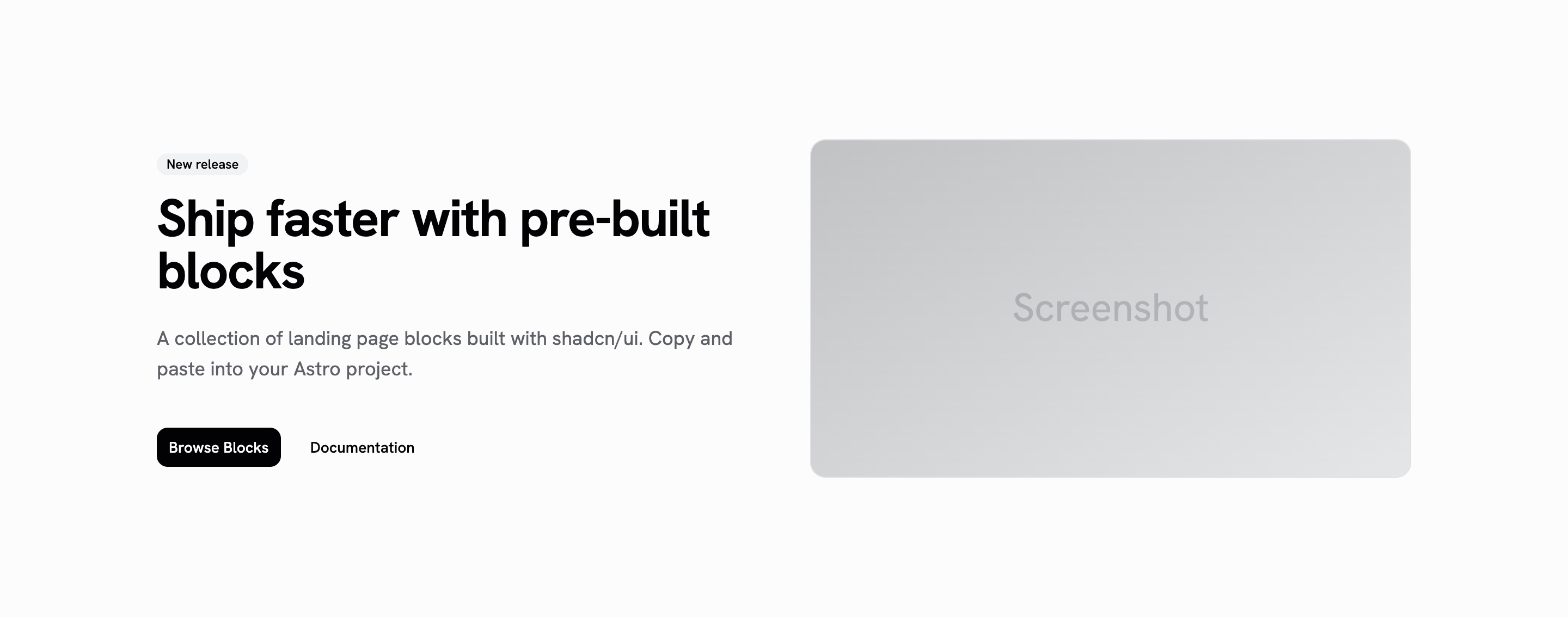
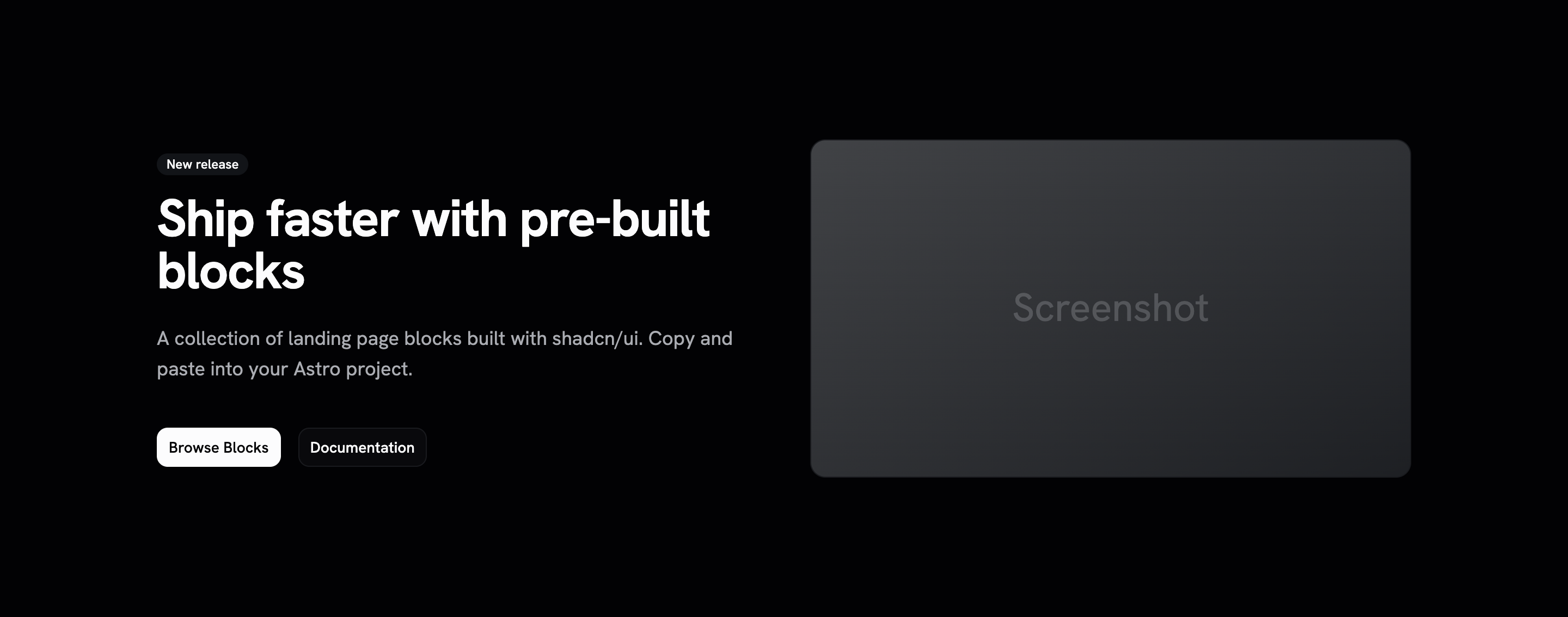
Split hero with content on the left and image or screenshot on the right. Zero-JS Astro component.
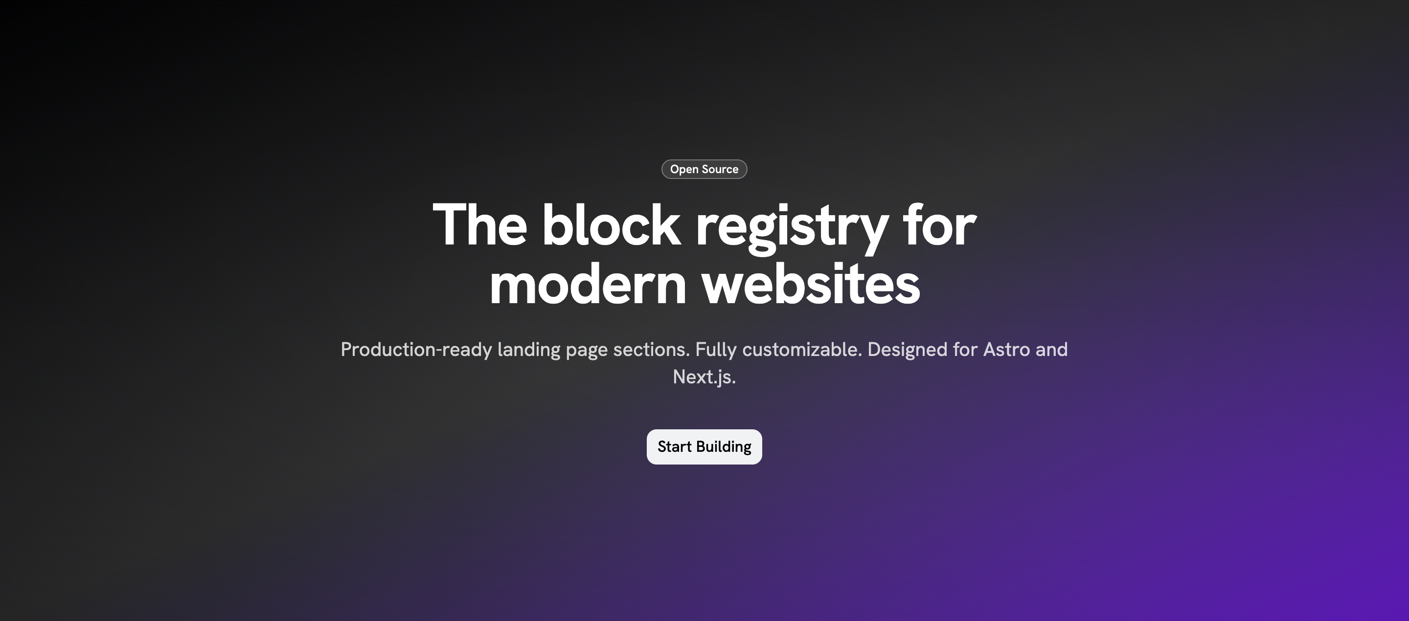
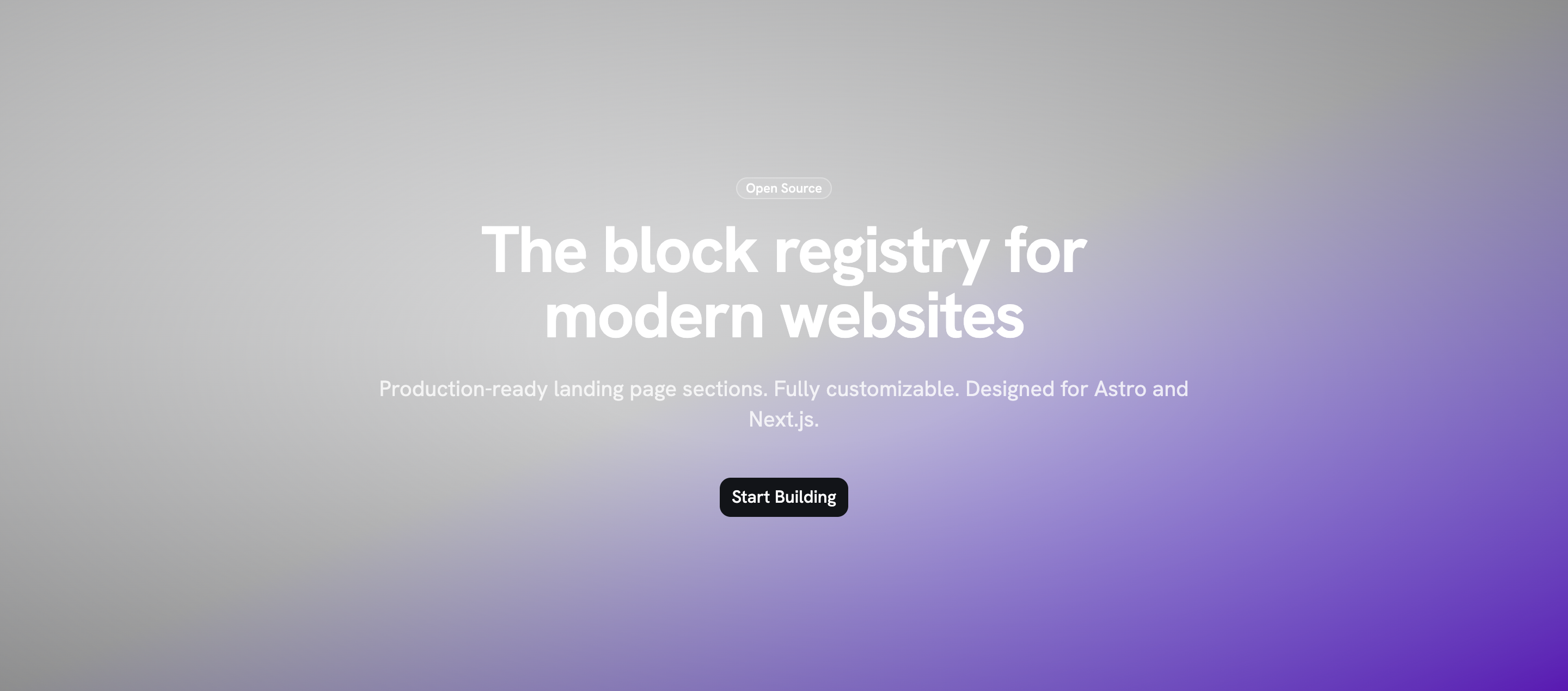
Hero with gradient background, floating badge, and a single prominent CTA. Zero-JS Astro component.
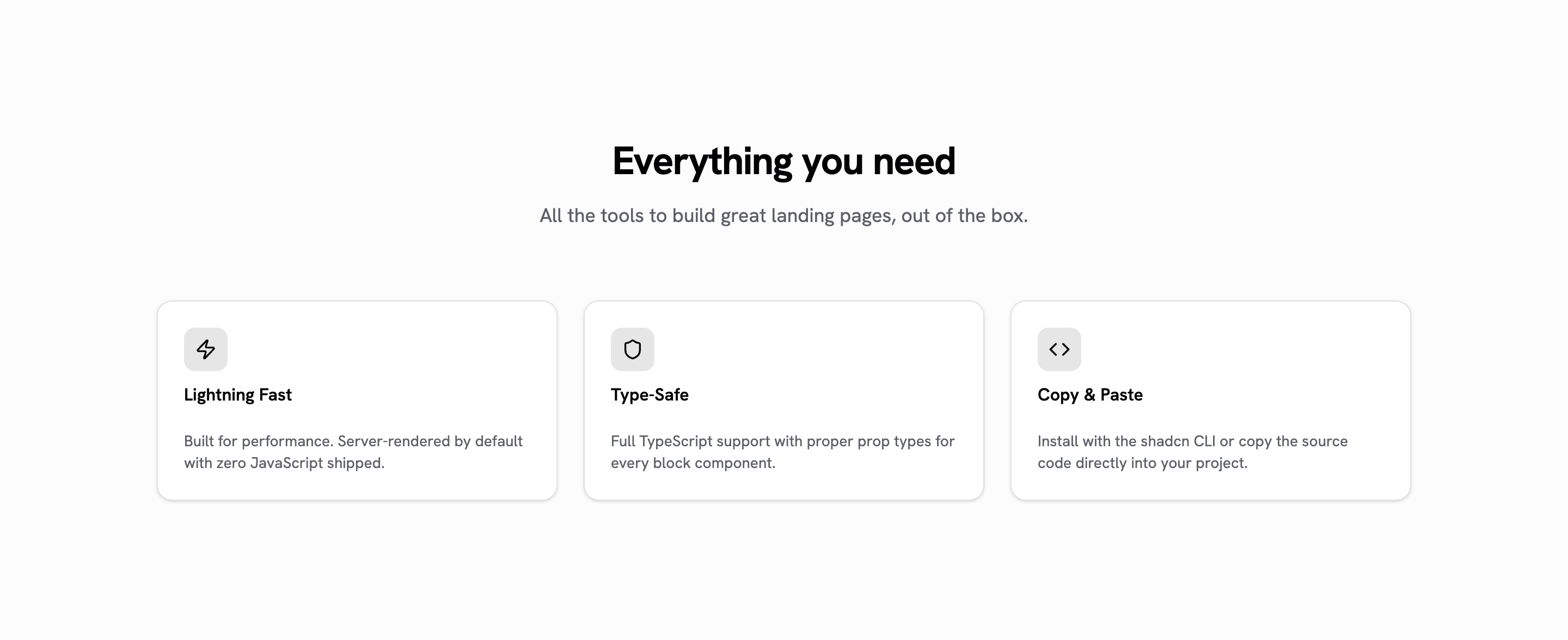
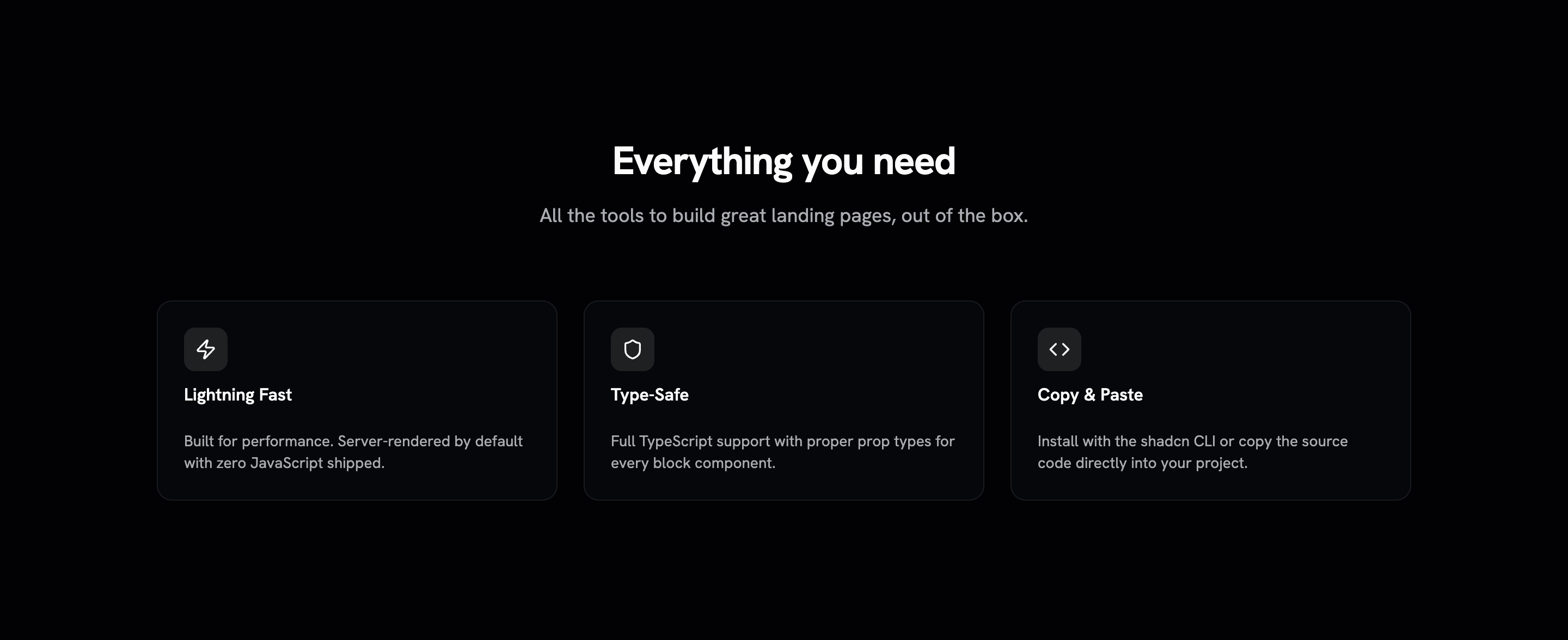
3-column feature grid with icons, titles, and descriptions in cards. Zero-JS Astro component.
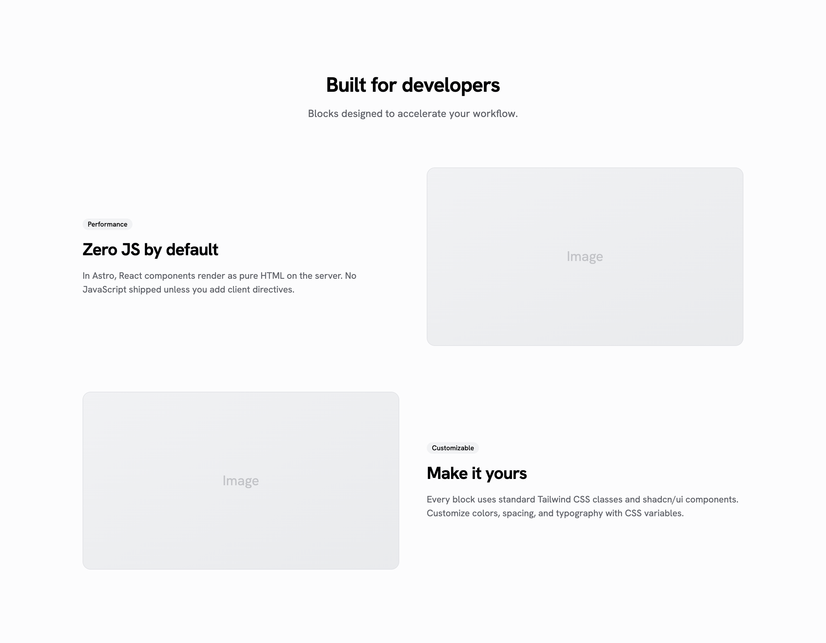
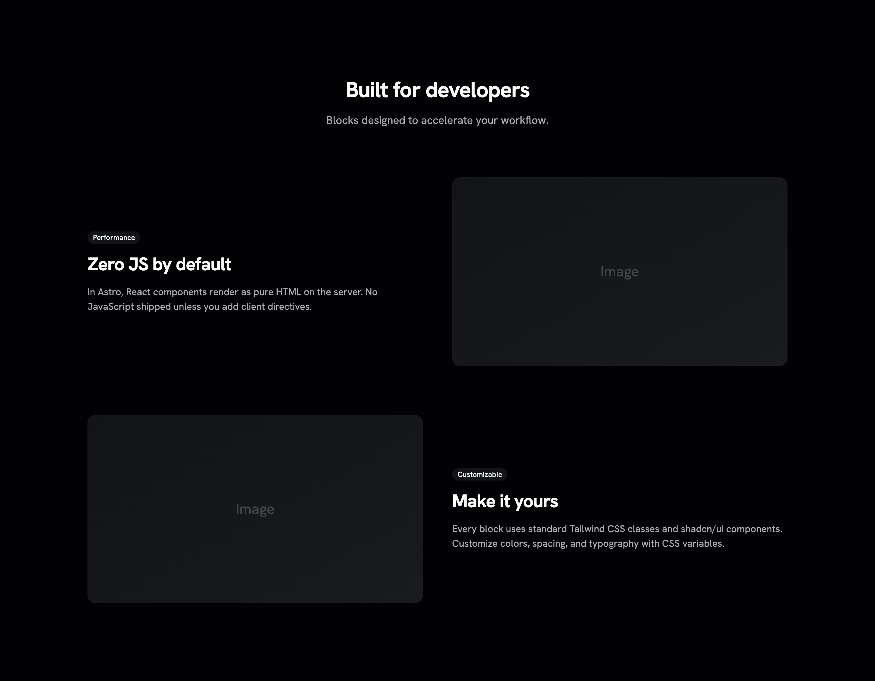
Alternating image and text sections to showcase features. Zero-JS Astro component.
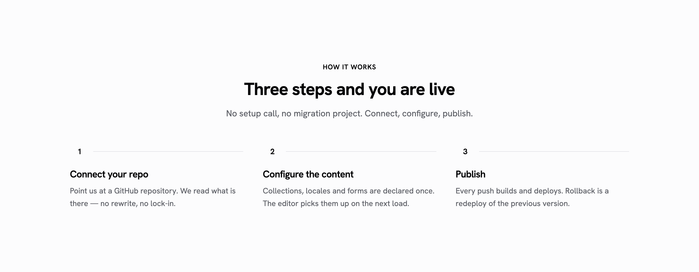
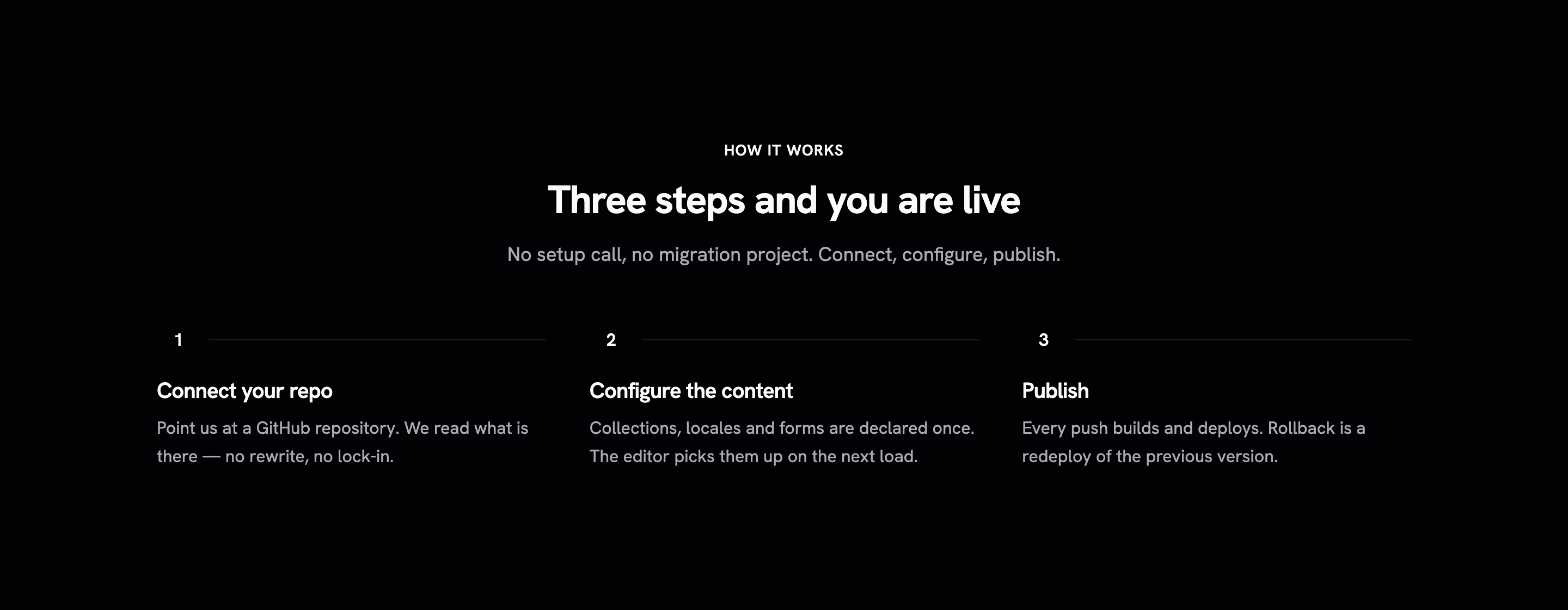
Numbered steps for a how-it-works section, with optional eyebrow and description. Zero-JS Astro component.
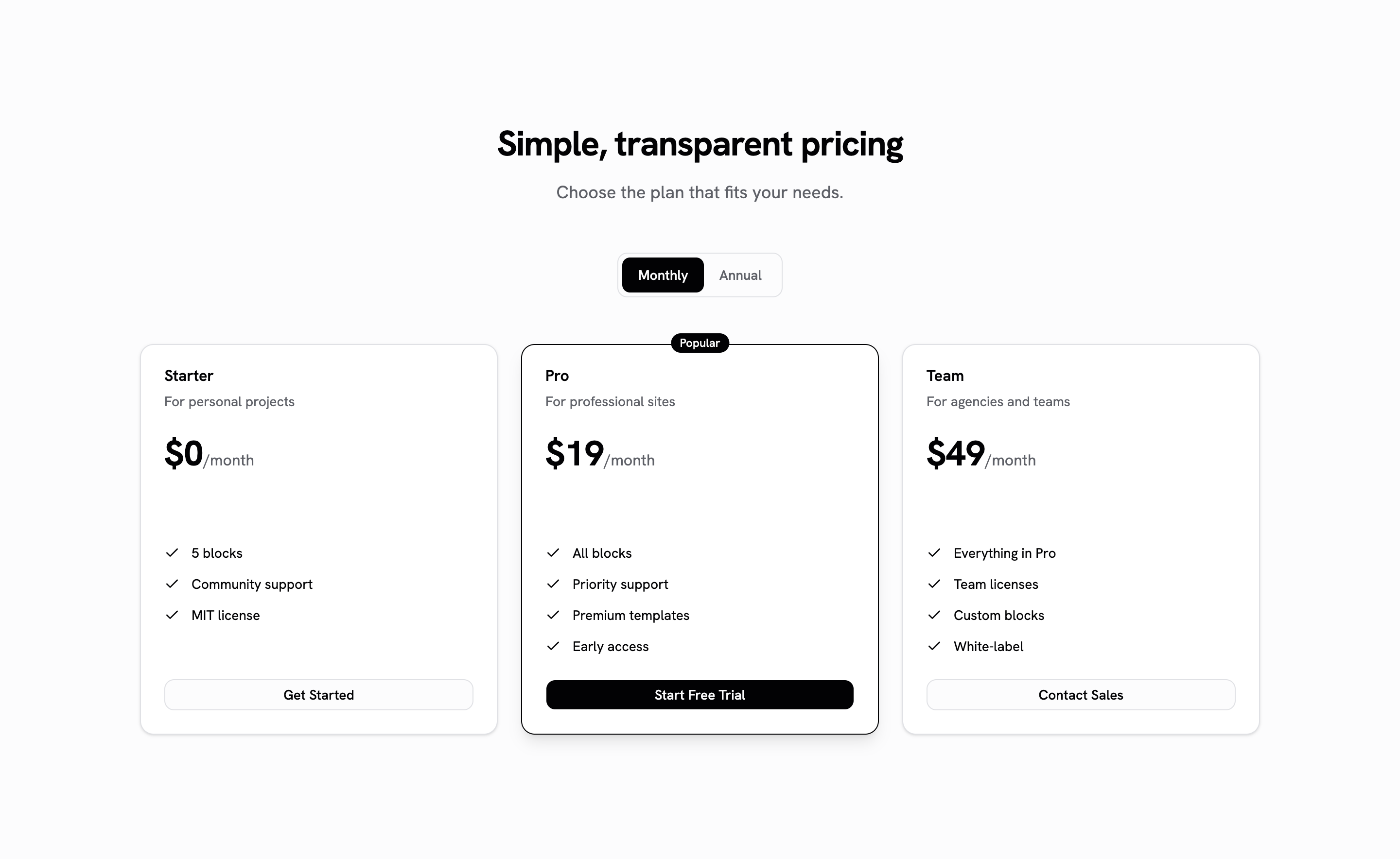
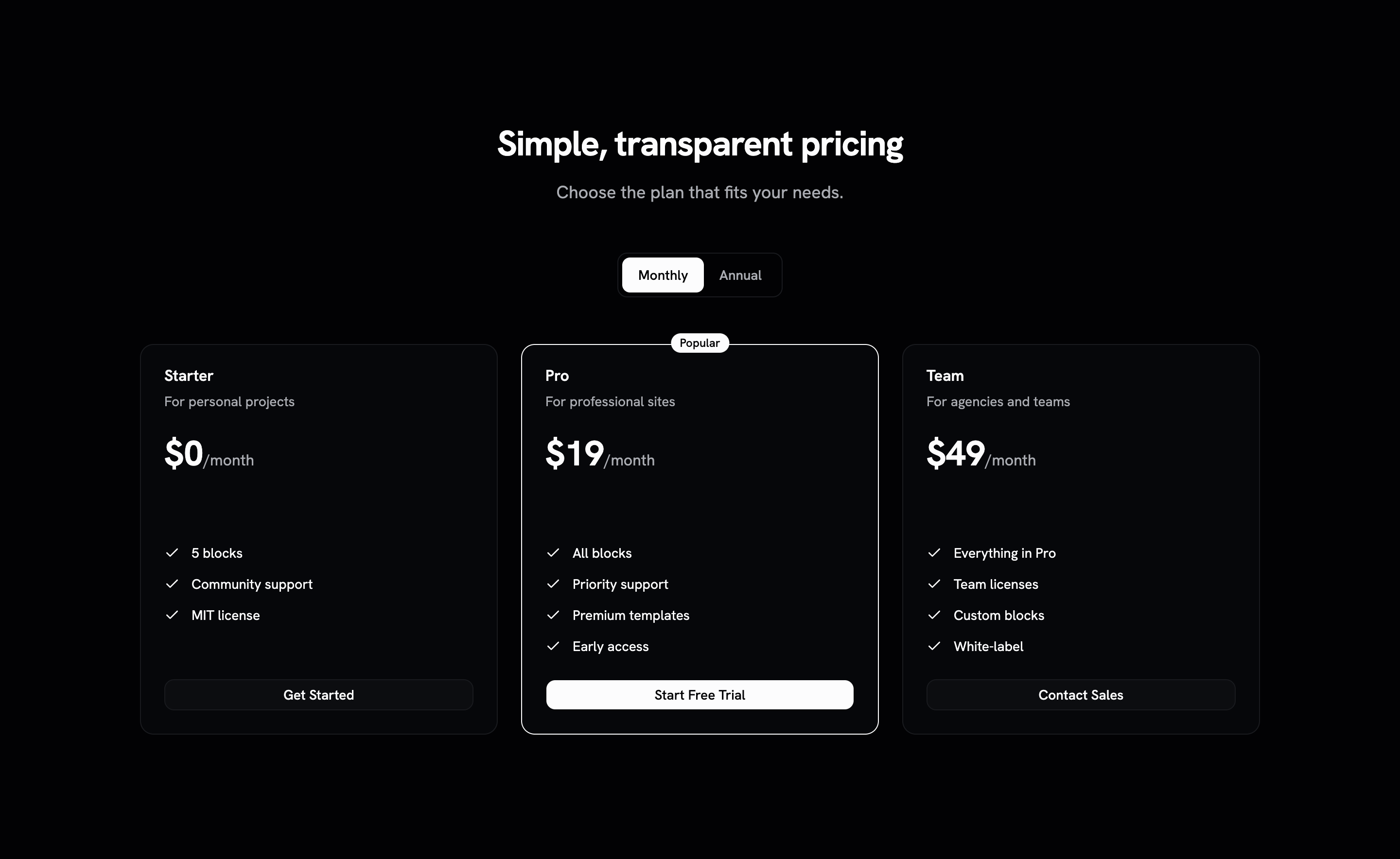
Three-tier pricing cards with monthly/annual toggle and feature lists.
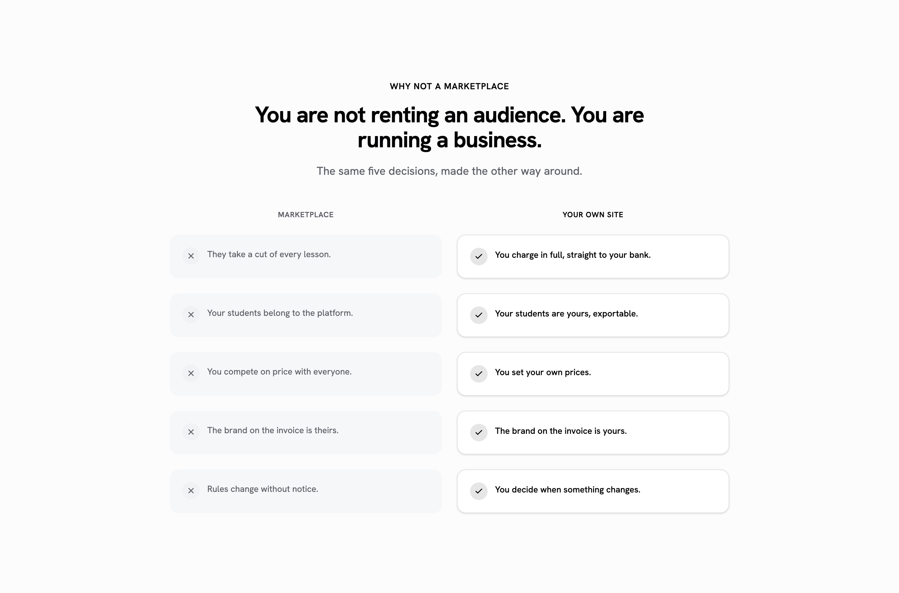
Two-column comparison of paired statements, with column labels and check/cross marks. Zero-JS Astro component.
Full-width CTA banner with gradient background, heading, and action buttons. Zero-JS Astro component.
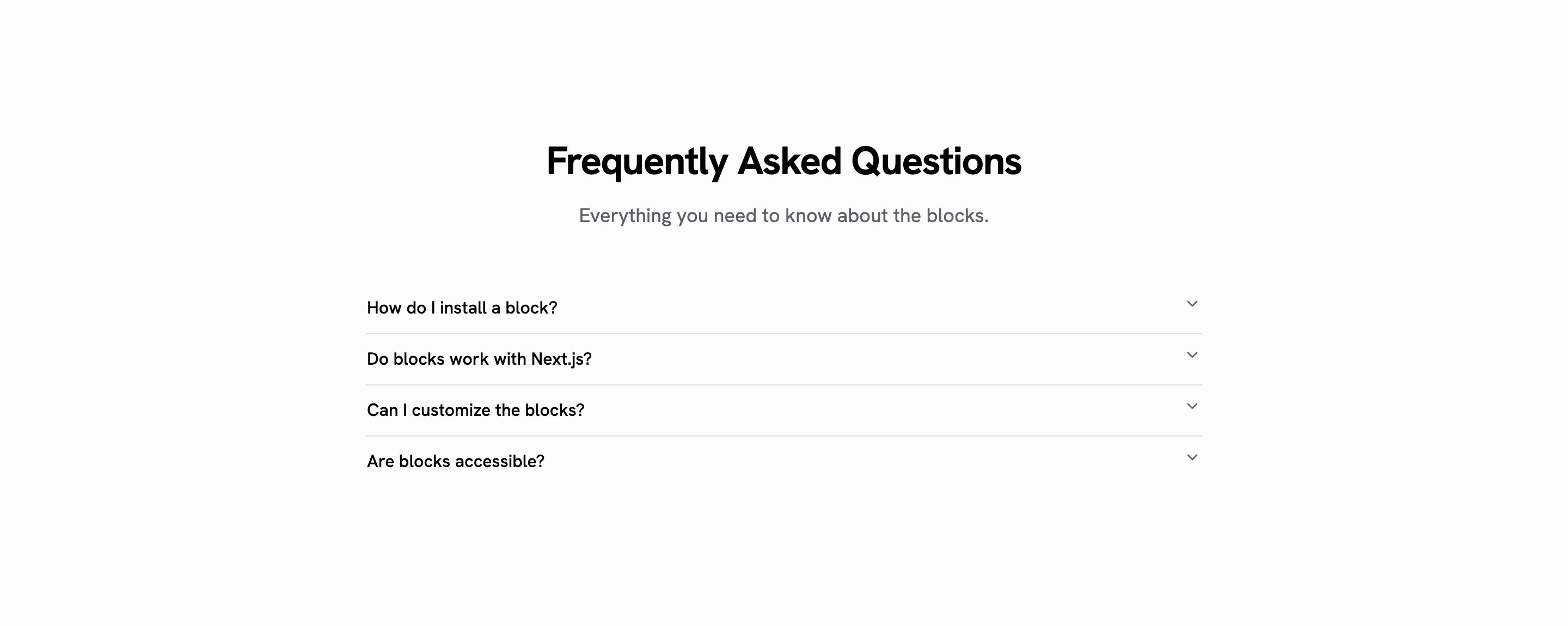
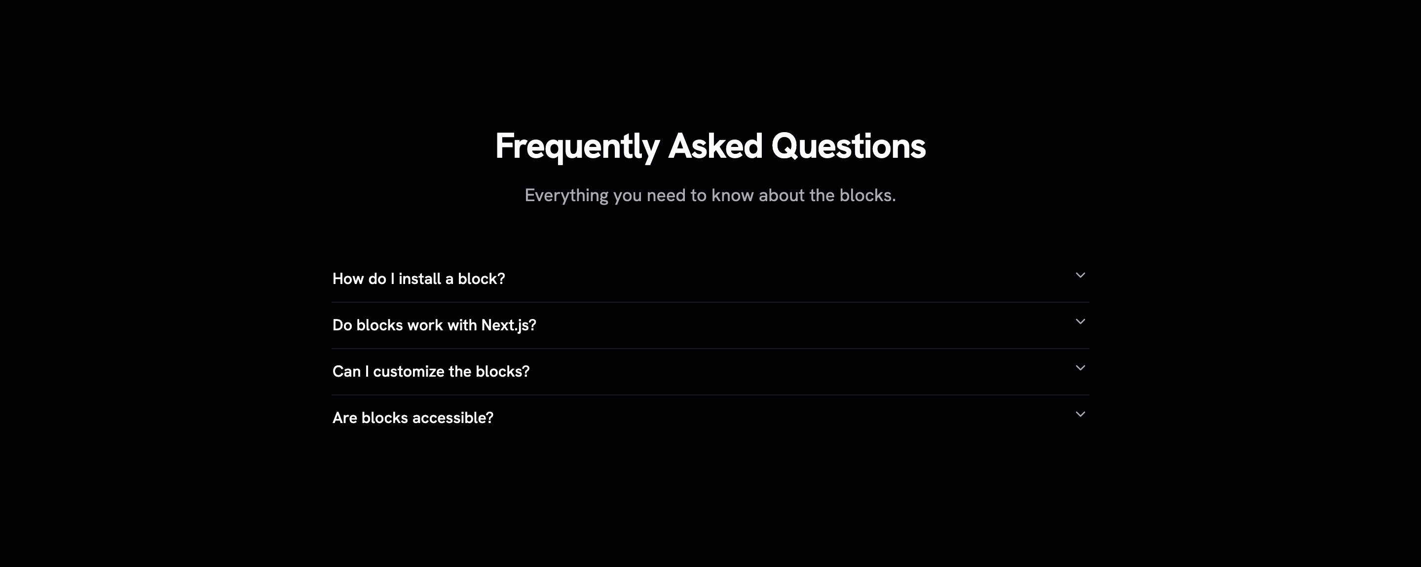
FAQ section with accordion for expandable questions and answers.
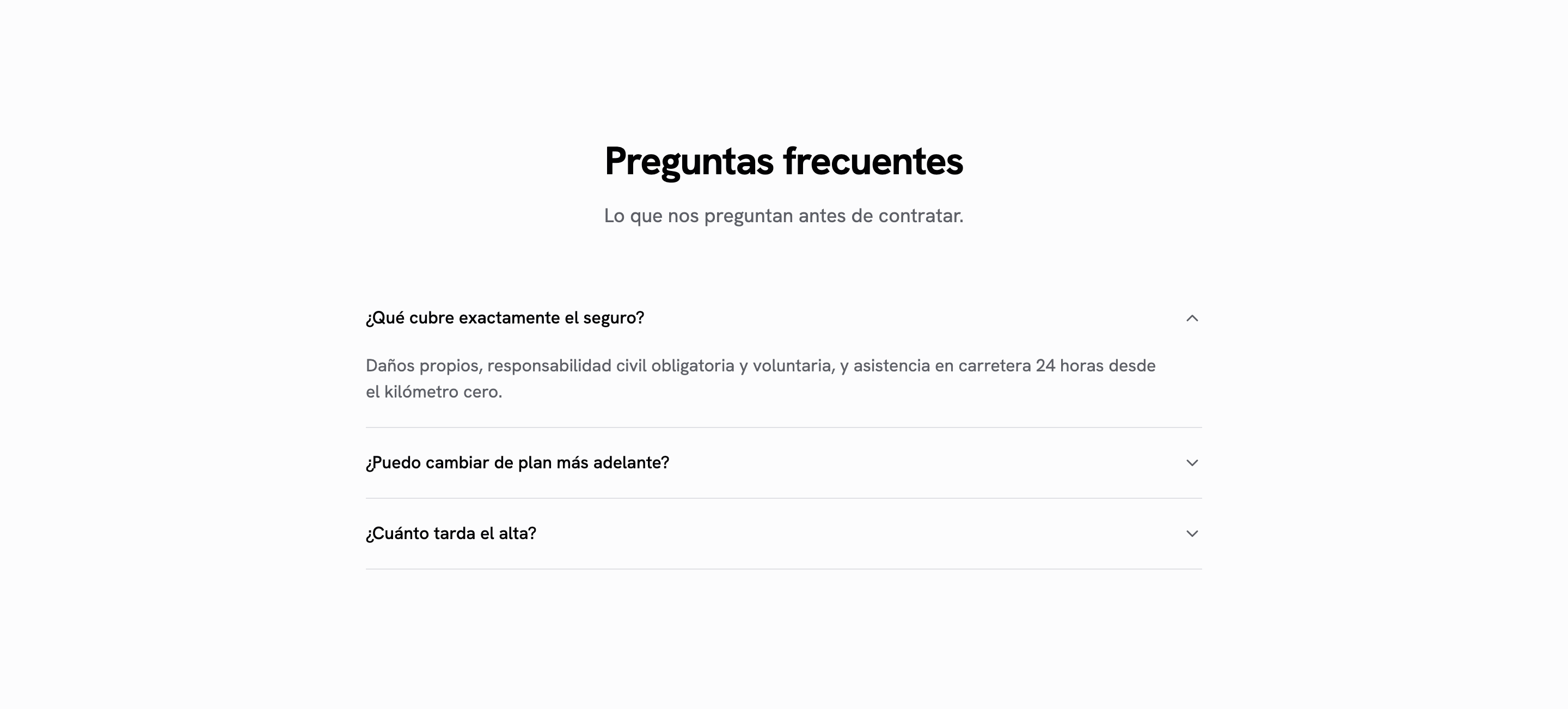
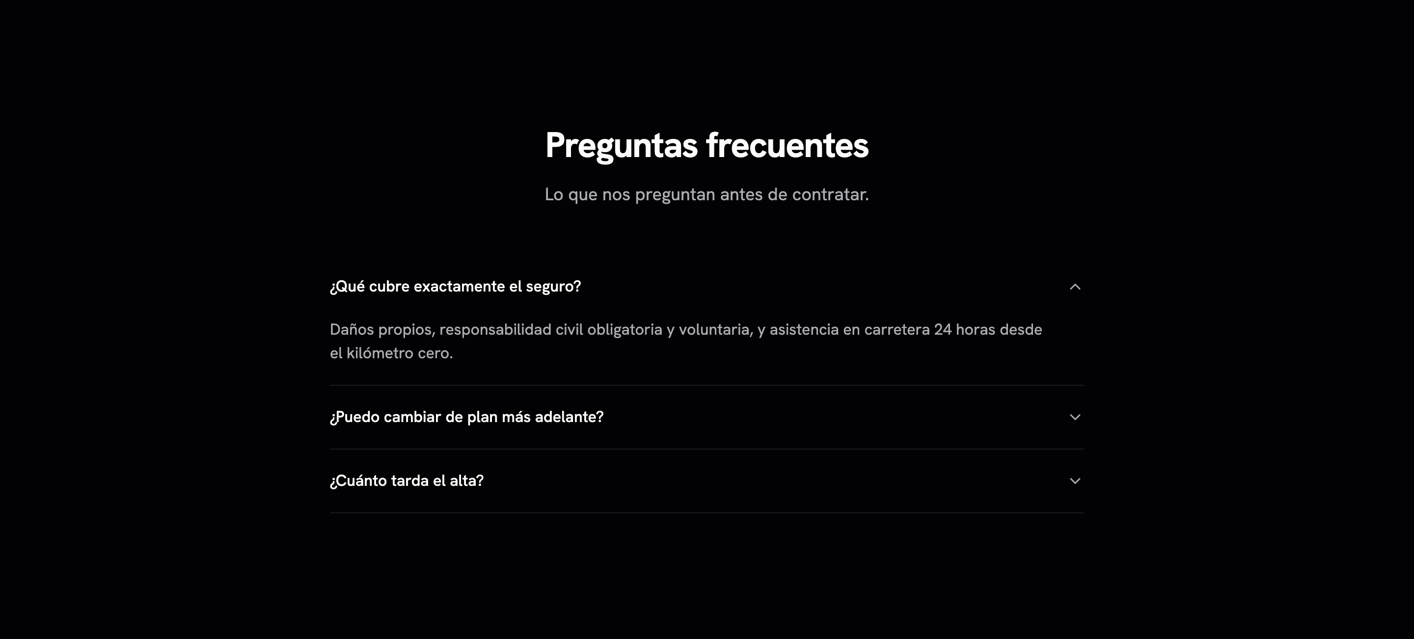
FAQ con `<details>` nativo: cero JS, respuestas dentro del HTML servido e indexables. El hermano sin hidratar de faq-01.
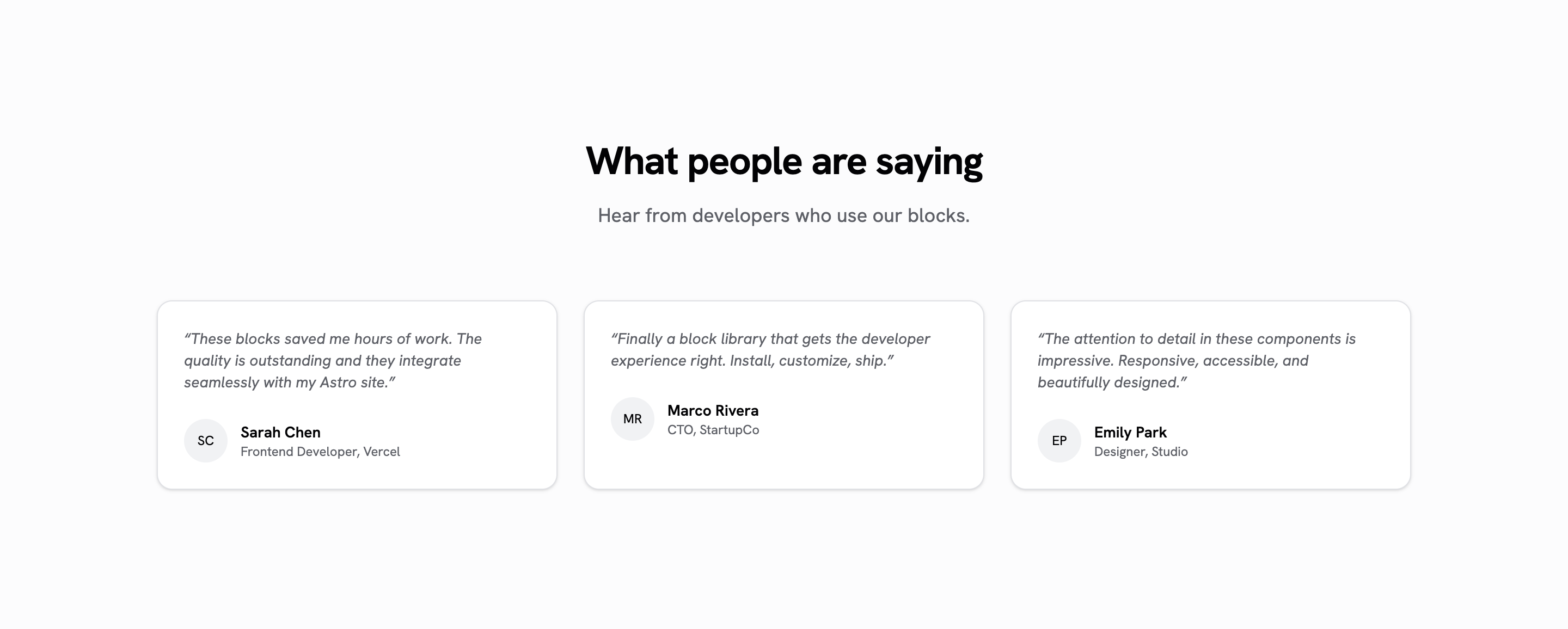
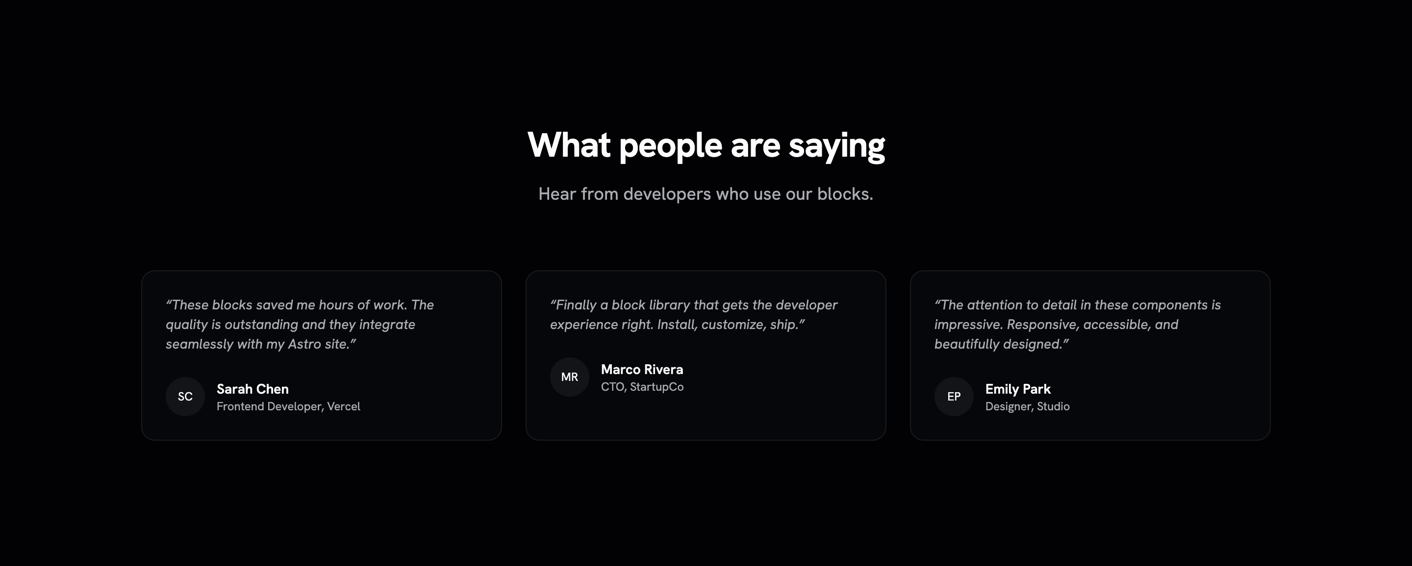
Testimonial grid with avatar, name, role, and quote cards. Zero-JS Astro component.
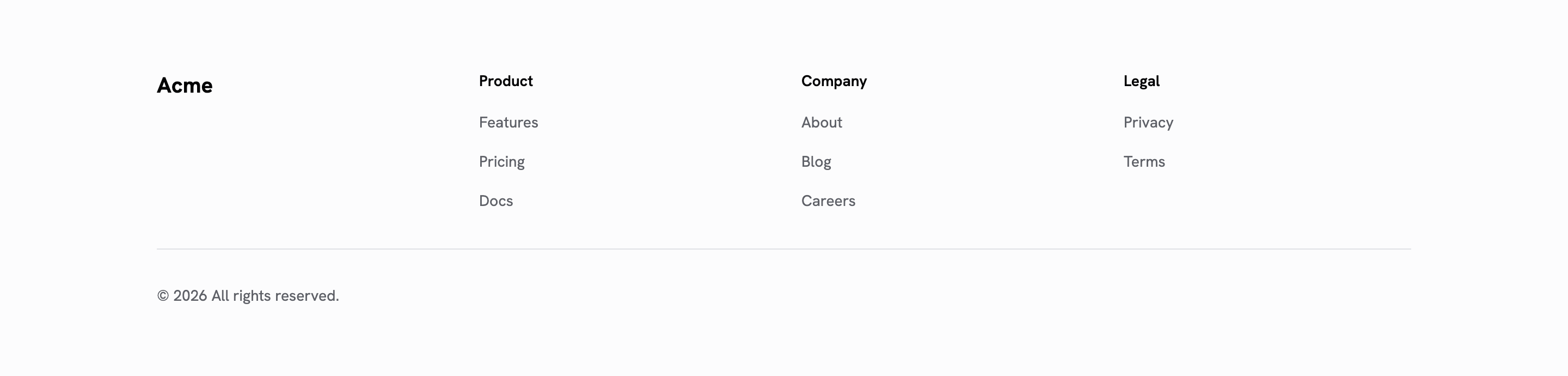
Multi-column footer with navigation links, social icons, and copyright. Zero-JS Astro component.
Responsive navbar with desktop navigation and mobile hamburger menu.
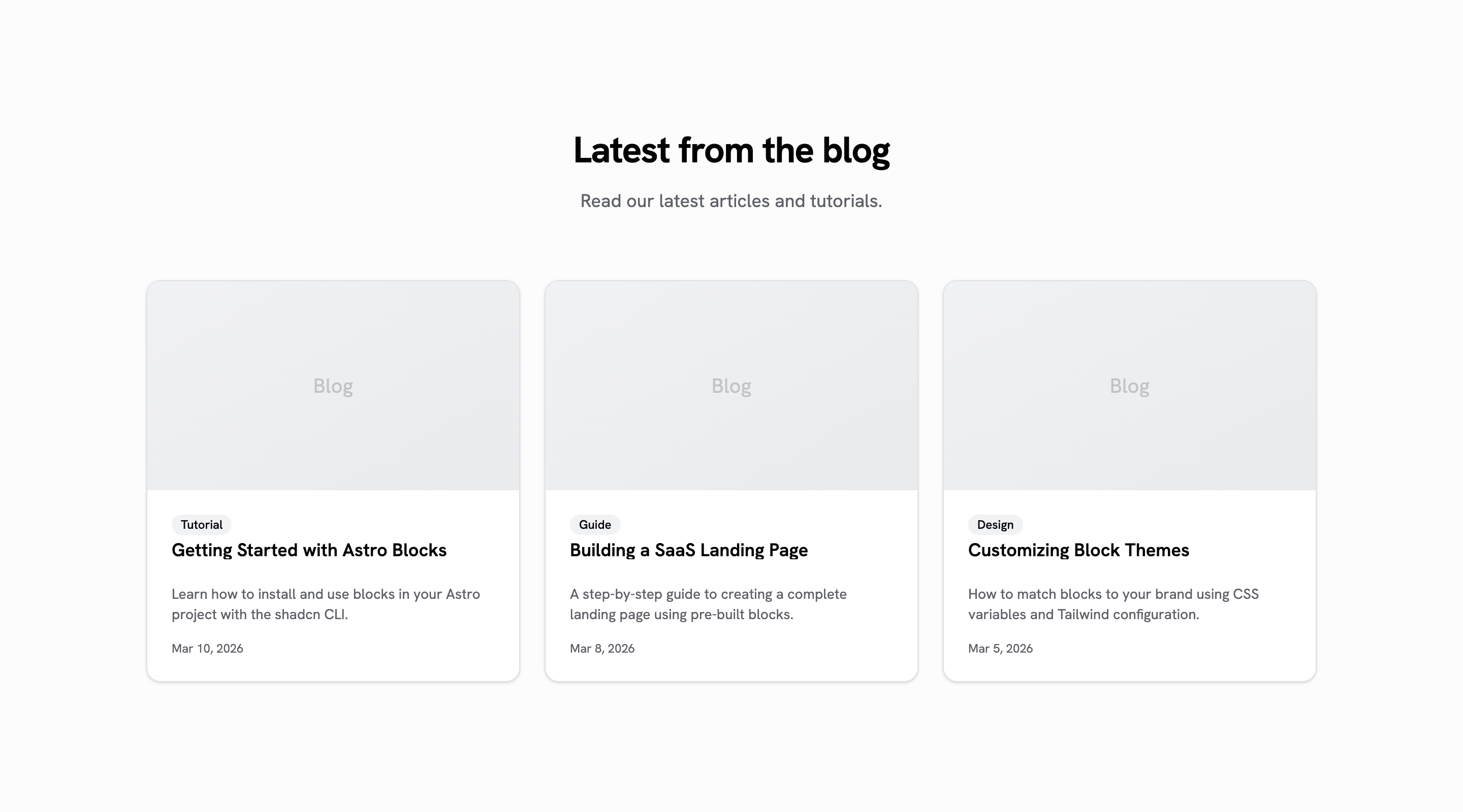
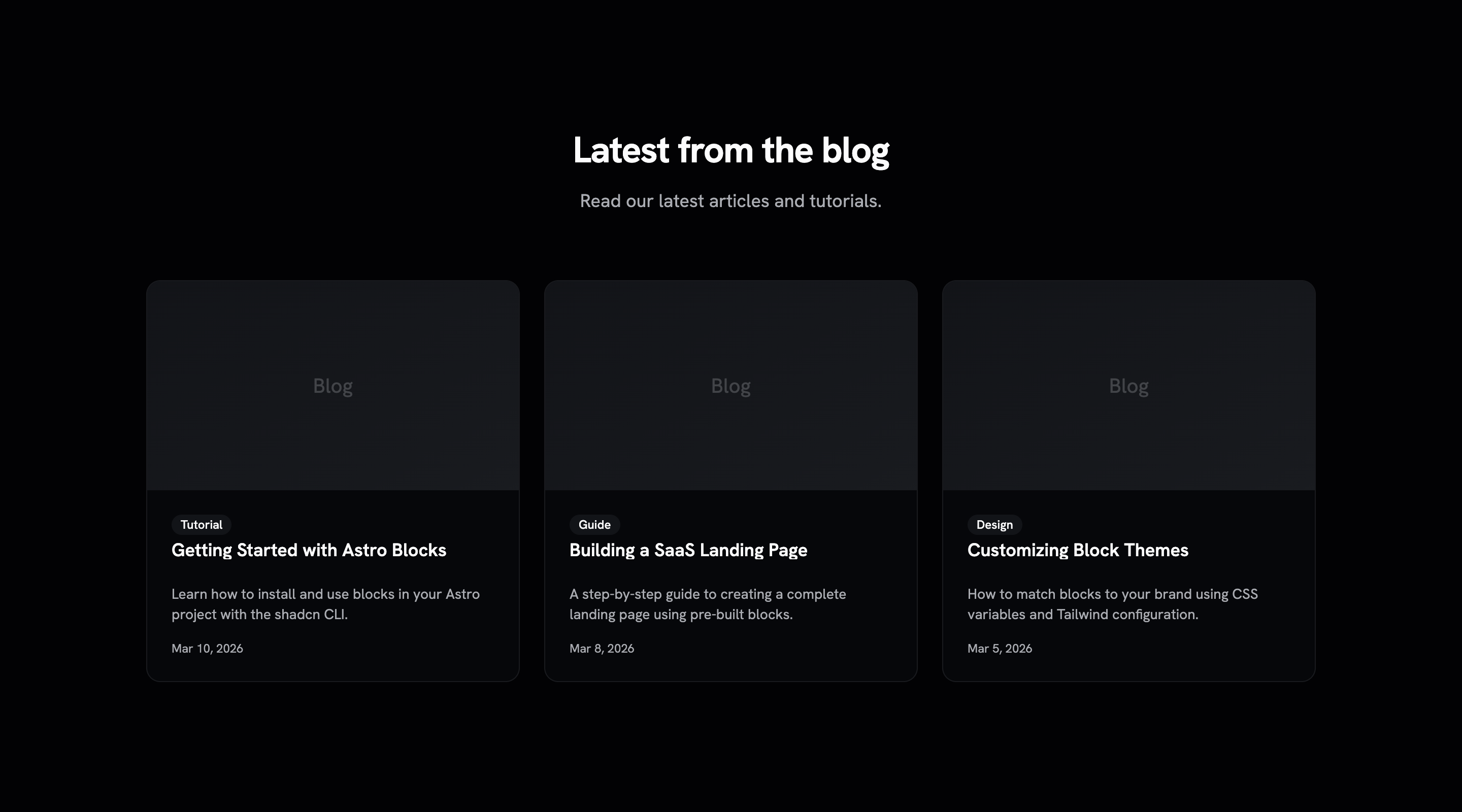
Responsive grid of blog post cards with image, title, excerpt, and metadata. Zero-JS Astro component.
Email newsletter signup section with input and submit button. Zero-JS Astro component.
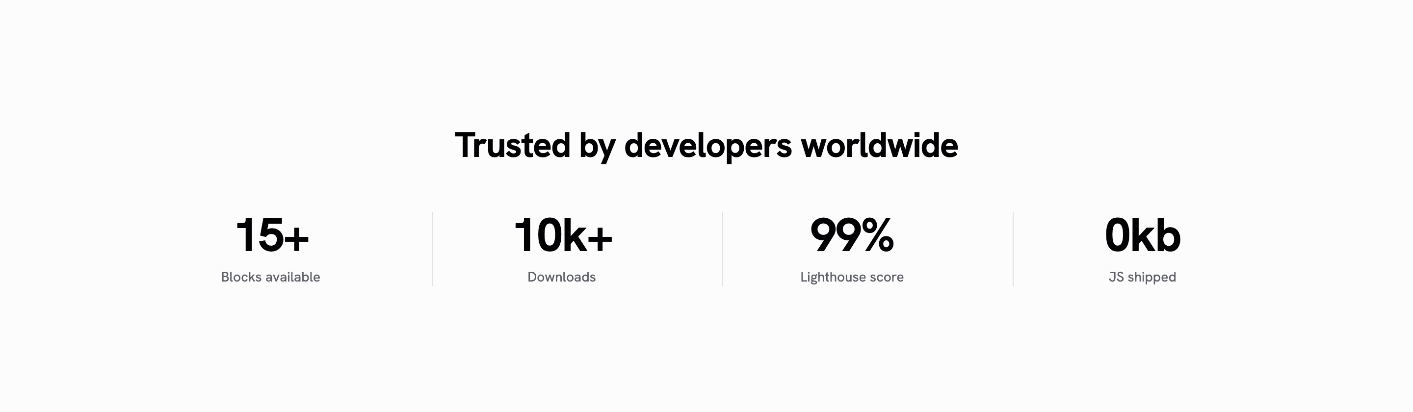
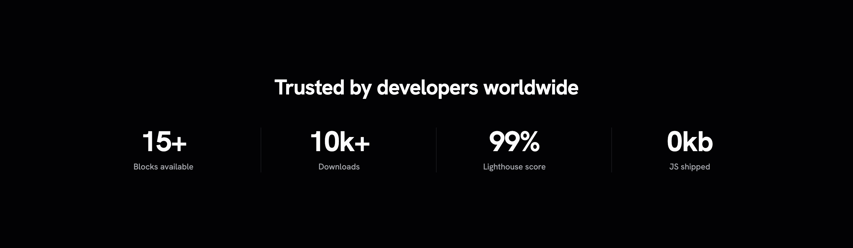
Row of key statistics with large numbers and labels. Zero-JS Astro component.
"Trusted by" logo cloud section with grayscale hover effect. Zero-JS Astro component.